Using the Portal Features
This page describes how to use the basic features of the InterSystems User Portal.
Alerts in the User Portal are unrelated to production alerts.
Also see Accessing the BI Samples.
Displaying Folder Items
The main area of the User Portal displays the dashboards and pivot tables in this namespace, with different icons for dashboards and pivot tables. This item can also display links to web pages. All these items are known as folder items, because they can be grouped into folders (which are used primarily for security).
At the top of this area, use the Covers and List options to display Covers View and List View, respectively.
You can also use Menu > Find Dashboard... to open a dashboard.
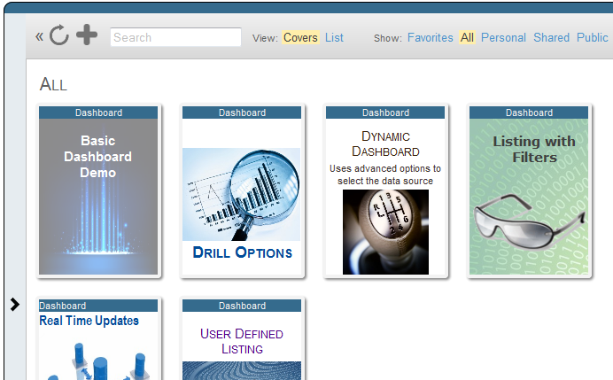
Covers View
The following shows an example of the Covers View:
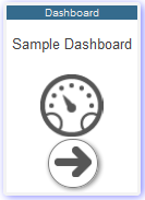
When you hover the cursor over a cover, the system displays an arrow on the cover, as follows:
If you select the cover arrow, the system displays the dashboard or other item.
If you select anywhere except for the arrow, the system displays an informational dialog box like the following:
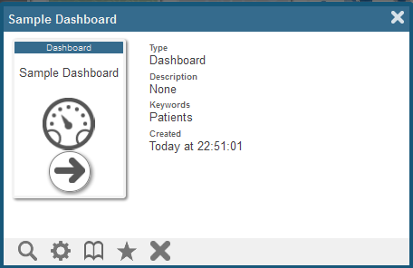
To close this dialog box, select the X in the upper right or select the screen outside of this dialog box.
List View
The following shows an example of the List View:
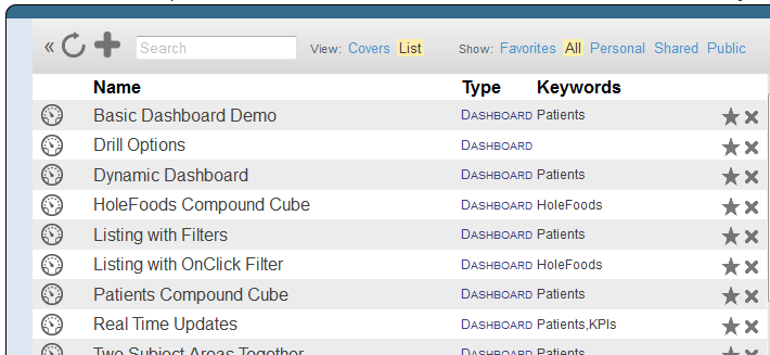
This view groups folder items by the folders to which they belong.
Options Available in the Main Area of the User Portal
In the main area of the User Portal (the right area), you can do the following:
-
(Only in List View) Expand or collapse a folder. To do so, select the triangle to the left of the folder.
Covers View does not display folders.
-
View an existing folder item. To do so, select the cover arrow (in Covers View) or select the name of the item (in List View).
Then, for dashboards, see Using Dashboards for information on your options. If you have the appropriate permission, you can then edit the dashboard. See Creating Dashboards.
Or, for pivot tables, if you have the appropriate permission, you can then edit the pivot table. See Using the Analyzer.
-
Search for an item. To do so, type your search text into the box at the top of the right area and then select Go.
The system finds all items whose names or keywords include the given text; the search is not case-sensitive.
-
Display different groups of folder items.
For details, see the next section.
-
Delete a folder item. In Covers View, select the cover and then select the X button. In List View, select the X button in the row for that item.
In either case, the system prompts you to confirm this action.
-
Mark a folder item as a favorite. In Covers View, select the cover and then select the Favorites button
 . In List View, select the Favorites button in the row for that item.
Visibility of Folders and Folder Items
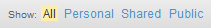
The User Portal lists only a subset of the folders and folder items. You can use the Show options to display different groups of folder items.
The options are as follows:
-
All — Shows all public folders and items. This is controlled by the Public setting of an item.
Important:Note that the Public setting controls only whether the item is displayed in the User Portal. It does not otherwise control access.
-
Personal — Shows all public items that you own. This is controlled by the Owner setting of an item. Note that, by default, the owner of an item is the InterSystems IRIS® data platform user who created it.
-
Shared — Shows all public items that you do not own and that have assigned resources to which you have permission. This is controlled by the Resource setting of an item.
-
Public — Shows all public items that you do not own and do not have assigned resources.
The following table lists all the possible variations and indicates the visibility of the folders and folder items, depending on what you choose for Show:
| Marked as Public? | Owner | Resource | User Portal Displays Item to You? |
|---|---|---|---|
| Yes | You | Any | Yes (if you select All or Personal) |
| Yes | Someone else | No resource | Yes (if you select All or Public) |
| Yes | Someone else | Resource that is available to you | Yes (if you select All or Shared) |
| Yes | Someone else | Other resource | No |
| No | Any | Any | No (but the item might be available via the Menu, depending on its owner and resource) |
Similarly, to define an item so that only you can see it, do the following:
-
Set yourself as the Owner.
-
Specify a Resource that is available only to you.
-
Optionally select Public to display the item in the User Portal.
For background information, see Security in Business Intelligence.
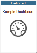
Customizing Covers
When you display the Covers View in the User Portal, the system displays a rectangular cover for each item, and there is a default cover for each type of item. For example, the default cover for a dashboard looks like the following example:
To customize a cover:
-
If you are currently viewing the User Portal, first select the View Covers option. Then select the cover (but do not select the arrow that is temporarily shown in its bottom area). the system displays an information dialog box:
Then select the Cover Design button
 .
. -
(For a dashboard) If you are currently viewing the dashboard, select Menu > Design Book Cover.
In either case, the system displays the Book Cover Editor, which looks like this:
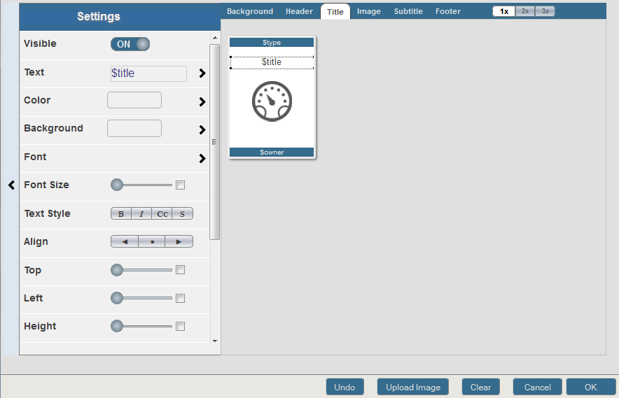
Note the following:
-
To customize part of a cover, either select a tab at the top or select an area in the cover preview. In either case, the left area then displays a list of options.
-
To control the size of the cover preview, use the 1x, 2x, and 3x buttons at the right.
-
To undo a change, select Undo (not shown here).
-
To clear all customizations and restore the default cover, select Clear.
-
To close the editor without saving changes, select Cancel.
-
To save changes and close the editor, select Save.
-
To upload an image file, select Upload Image.
The system copies the image files to the directory install-dir/CSP/broker/covers. The image files are available in all InterSystems IRIS namespaces.
-
To hide the list of options on the left, select the < button.
Cover Parts
A cover has the following parts that you can customize separately:
-
Background — The entire area within the rectangle, including the areas behind the header and footer (which can be hidden).
-
Header — A rectangle at the top. By default, this is shown in a contrasting color and displays the type of the item (dashboard, pivot, and so on).
-
Title — By default, this is displayed below the header and displays the name of the item (dashboard, pivot, and so on). For a dashboard, this displays the dashboard title, if any; otherwise it displays the dashboard name.
-
Image — An image included on the cover. By default, this image is in the middle of the page. The system uses a default image for each type of folder item.
-
Subtitle — By default, this is blank. The default position is below the image.
-
Footer — A rectangle at the bottom. By default, this is shown in a contrasting color and displays the owner of the item.
Cover Options
The following table summarizes the options available for each part:
| Option | Notes | Available for Background? | Available for Header, Title, Subtitle, and Footer? | Available for Image? |
|---|---|---|---|---|
| Visible | Optionally clear this option to hide this element | yes | yes | yes |
| Text | Type a string or select a token to represent specific text from the selected item | no | yes | yes |
| Color | Select a color to use for the text | no | yes | yes |
| Image | Select an image or type the URL of an image | yes | no | yes |
| Background | Select a color for the fill pattern for this element | yes | yes | yes |
| Make Image Full Size | Select this option to make the image fill the background, if it does not already do so | yes | no | no |
| Font | Select a typeface | no | yes | yes |
| Font Size | Use the slider to specify the font size or select the check box to reset to the default | no | yes | yes |
| Text Style | Select a text style | no | yes | yes |
| Align | Select an option to make this element left-aligned, centered, or right-aligned | no | yes | yes |
| Top | Use the slider to specify the top position of this element or select the check box to reset to the default | yes | yes | yes |
| Left | Use the slider to specify the left position of this element or select the check box to reset to the default | yes | yes | yes |
| Height | Use the slider to specify the height of this element or select the check box to reset to the default | yes | yes | yes |
| Width | Use the slider to specify the width of this element or select the check box to reset to the default | yes | yes | yes |
| Margin | Use the slider to specify the margin around this element | yes | yes | yes |
| Padding | Use the slider to specify the padding around this element | yes | yes | yes |
| Opacity | Use the slider to specify the opacity of this element | yes | yes | yes |
| Radius | Use the slider to specify the radius of the corners of this element | yes | yes | yes |
Customizing the Covers View
You can customize the font and colors used in the background of the Covers View in the User Portal. For example:
To do so:
-
Select the < button at the left.
It is not necessary to be in Covers View.
-
Select Background.
-
Specify the following options:
-
Color — Specify the font color for labels in the background (such as the default category name, All, shown here).
-
Background — Specify the color for the background.
-
Font — Specify the typeface for labels.
-
Font Size — Specify the font size for labels.
-
Text Style — Specify the text style for labels.
Or select Reset Styles to remove all customizations.
-
These changes are visible to all users in this namespace.
Using Worklists in the User Portal
The home page of the User Portal always includes two worklist areas on the left, and these display different worklists depending on your site configuration. For any worklist area, the upper right corner might display icons to indicate which worklists it can display. For example:
If no icons are shown, this worklist area can display only one worklist.
The highlighted icon indicates which worklist is currently displayed in the worklist area. You can select a different icon to display the corresponding worklist in this area instead.
For the User Portal, the available worklists are as follows:
-
The Alerts worklist displays recent alerts sent to you. For example:
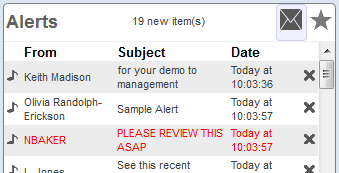
For information, see Viewing Alerts.
-
The Details worklist displays details for a pivot table or dashboard. For example:
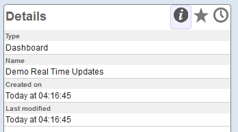
To display details for an item, select the icon to the left of the item name in the main area of the User Portal. Then the system refreshes the Details worklist.
-
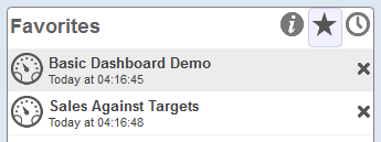
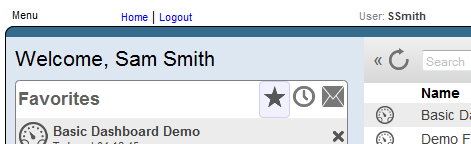
The Favorites worklist displays any items that you have marked as favorites. For example:
-
The Recent items worklist displays items that you have recently accessed, in descending order by the date you accessed them. For example:
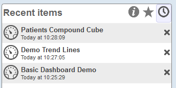
In all cases, to open an item, select it. To remove an item from a worklist, select the X button.
Hiding or Showing the Worklists
The upper right corner of the main area displays a << button that you can use to toggle the display of worklists:
Select the << button to hide the worklists. Then select the >> button to display them again if needed.
Registering or Unregistering for Alerts
To change whether you are registered for alerts:
-
Access the User Portal home page.
-
Select Menu > Register for Alerts.
-
Specify the following options:
-
Full name — Type the full name that you want other users to see when they send alerts.
-
Alerts enabled — Select this option to receive alerts.
-
-
Select OK.
Sending an Alert
You can send alerts to other InterSystems IRIS Business Intelligence users, if those users have registered for alerts. To do so:
-
Open a dashboard that contains the data about which you want to send the alert.
-
Select Menu > Send Alert.
-
Specify the following options:
-
Send to — Select each user who should receive this alert.
-
Subject — Optionally type a short message to display in the Alerts worklists of the other users.
-
Priority — Optionally select a priority; this affects how the alert is displayed. The default is Normal priority.
-
Comments — Optionally type a longer message.
-
-
Select OK.
Viewing Alerts
To view your alerts:
-
In a worklist area, select the Alerts button
 .
.You might see something like this:
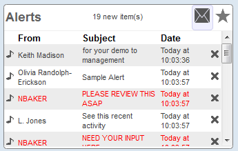
Note the following items:
-
A star on the left indicates that you have not yet opened this alert.
-
High-priority items are shown in red font, normal-priority items are shown in black font, and low-priority items are shown in gray font.
-
-
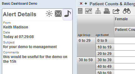
Select anywhere in the row for an alert to open it. The system then opens the associated dashboard and displays the alert details in the Alert Details worklist, as follows:
Sending Email
From within a dashboard, you can send email that contains a link to the dashboard, if your system is configured for this. To do so:
-
Open a dashboard that contains the data about which you want to send the alert.
-
Select Menu > Send Email.
If this option is not present, then your system is not configured to support email.
-
The system then does one of the following:
-
Displays the default email client on your machine, with a message that contains a link to the dashboard.
Edit the message, specify one or recipients, and send it as usual.
-
Displays a dialog box.
Type the email address of the recipient, type a brief message to include along with the generated link, and select OK.
If you have previously sent email, you can choose a recipient from the Send to drop-down list.
-
How Business Intelligence Supports Email
Your can be configured to support email in either of two ways:
-
It can use client-side email. In this configuration, when you send email, the system accesses the default client-side email program such as Microsoft Outlook. You use this to send email in the usual way, and you have access to your address books.
-
It can use server-side email. In this configuration, when you send email, you must type the email address of the recipient. The system routes the message to the configured email server.
It can also be configured not to support email. Consult your implementers, who should read Implementing InterSystems Business Intelligence.
Managing Workflow Tasks
If you are a workflow user, the main area of the User Portal displays an item labeled Workflow Inbox.
You use this to manage your workflow tasks. If you select Workflow Inbox, the User Portal displays something like the following:
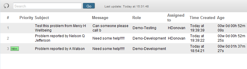
This list shows all unclaimed workflow tasks (marked as NEW) and all open tasks assigned to you.
To manage a workflow task, select it to see its details, which are then displayed in the lower area of the page:
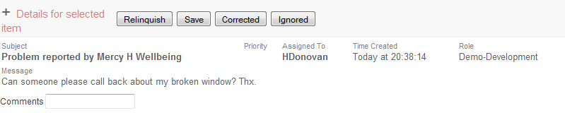
This example shows the built-in buttons and one custom editable field (Comments); you might see additional buttons and fields, depending on the task definition.
For a selected task, you can do any of the following:
-
Take ownership of the task. To do so, select Accept (not shown in the previous figure, in which the task has already been accepted). This indicates that you intend do perform the associated work. The task becomes assigned and is not longer visible in the Workflow Inboxes of other users.
-
Give up ownership of the task. To do so, select Relinquish. This causes the task to become unassigned and thus visible to all users in the same workflow role.
You can do this action and the following actions only if you own the task.
-
Indicate that you completed the task. To do so, select Corrected.
The task is then removed from the list.
The workflow process might then generate additional tasks, depending on how it is defined.
-
Mark the task as ignored. To do so, select Ignored.
The task is then removed from the list.
You use this option to indicate that you have encountered an error condition (such as not being able to contact the customer) and therefore the task cannot be completed.
-
Perform other actions by selecting other buttons in this area. The preceding figure shows only the built-in action items.
-
Enter values into editable fields. The preceding figure shows one custom editable field (Comments).
The purpose of these fields is to convey information to the next person who receives the task, to add information to the permanent record, or both. Therefore, be sure to provide meaningful entries.
Creating Links to Web Pages
In the User Portal, you can also create links to web pages. To do so:
-
Select the + button at the top.
Or select the < button at the left and then select Add.
-
Select Add Link.
-
Specify the following options:
-
Folder — Specify the folder to contain this item.
Also see Preparing for Folder Item Localization in Implementing InterSystems Business Intelligence.
-
Name — Specify the name of this item.
Also see Preparing for Folder Item Localization in Implementing InterSystems Business Intelligence.
Note that this name is used (along with Folder) as the logical name of the item; the system displays this logical name when you use the Save As option, for example.
-
Title — Specify the title of the dashboard.
If you specify a title, the main area of the User Portal displays the title. Otherwise, it displays the name.
Also see Preparing for Folder Item Localization in Implementing InterSystems Business Intelligence.
-
Link URL — Specify the URL.
-
Owner — Specify the InterSystems IRIS user who owns this item. If an item has an owner, then only the owner can specify the Access Resource value for the item; see the next item.
-
Access Resource — Specify the resource that is used to control access to this item. See Visibility of Folders and Folder Items.
-
Public — Select this option to control whether this item is displayed in the User Portal main area.
Important:This option does not control access to the item. Access is controlled instead by the Owner and Access Resource options, discussed earlier in this list.
-
Description — Briefly describe the item.
-
Keywords — List any keywords or phrases to help you find this item later. Specify a comma-separated list of keywords or phrases.
These keywords are displayed in the User Portal in List View.
-
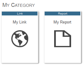
Category — Specify the category to which this item belongs.
-
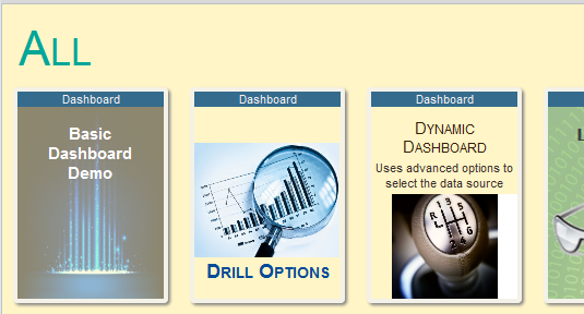
If you specify categories for items, Covers View groups items by category. For example: