
Creating a Dashboard
Creating a Dashboard
In this section we create a simple dashboard that includes the pivot tables which you created in the preceding section.
-
Click the Analytics link at the top of the page.
-
Click Home > Analytics > User Portal.
The system then displays the User Portal, which lists the existing public dashboards and pivot tables.
-
Click Menu > New Dashboard.
The system displays a dialog box that prompts you for basic information about the new dashboard.
-
For Folder, type or select Tutorial
-
For Dashboard Name, type Sample Dashboard
-
Click OK.
The system creates, saves, and displays the dashboard, which is initially empty.
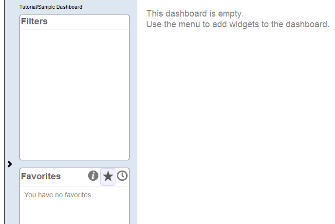
Notice the > button on the left side of the dashboard.
-
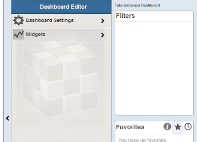
Click the > button.
This step expands the Dashboard Editor, as follows:
-
Click Widgets.
This step displays a list of any widgets that this dashboard currently contains (none in this case).
-
Click the + button.
This step displays a dialog box where you can choose some initial options.
-
In the dialog box, click Pivots and Charts, if this is not already expanded. The list expands to show a list of choices.
-
In this list, click Table.
-
Click the Search button
 next to Data source.
 -
Click Tutorial and then click Patients by Age Group
-
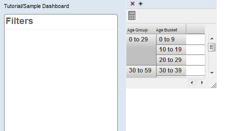
Click OK to add this widget.
The system displays the dashboard like this:
-
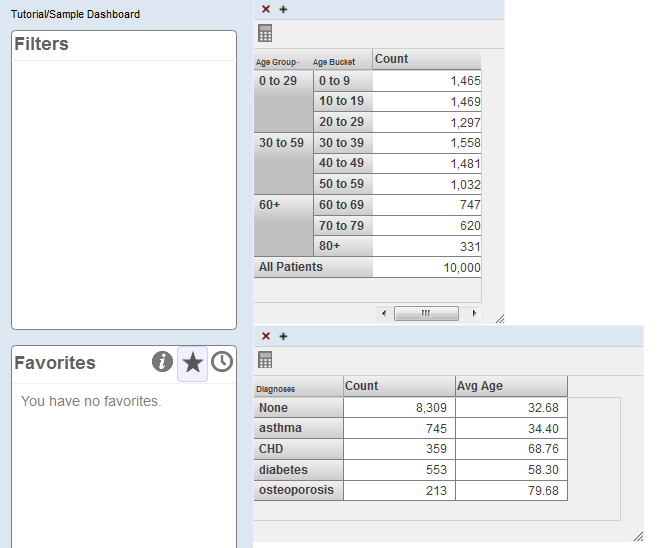
Repeat the preceding steps to add the other pivot table that you created in the previous section.
The newly added widget is placed in the same default position (in the upper left) and therefore covers the previously added widget.
-
Put the cursor into the title bar of the newly added widget and then drag this widget and drop it below the other widget.
You might want to leave space below the upper widget so that you can resize it.
-
Use the resize control in the lower right corner of each widget to resize it so that all rows are visible without scrolling.
-
Click Menu > Save.
The system saves the dashboard immediately.
-
Do the following to add some filter controls to this dashboard:
-
Open the Dashboard Editor.
-
Click Widgets.
-
Click the Patients by Age Group widget.
-
Click Controls.
The Dashboard Editor displays a list (currently empty) of any controls defined on the selected widget.
-
Click the plus sign button above the list.
The system displays a dialog box where you specify the control.
-
For Location, select Dashboard.
-
For Target, type *
-
For Action, select Apply Filter.
-
For Filter, select ZIP Code
-
For Control Label or Icon, type ZIP Code
-
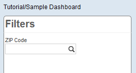
Click OK to add the control.
Now the upper left corner of the dashboard is as follows:
-
-
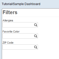
Repeat the preceding steps to add the Allergies and Favorite Color filters.
Now the upper left corner of the dashboard is as follows:
-
Reconfigure these filter controls so that each one has a default value. To reconfigure the ZIP Code filter:
-
Open the Dashboard Editor.
-
Access the definition of the Patients by Age Group widget.
-
Click Controls.
-
Click the ZIP Code control.
-
For Default Value, type 32007 and click the check mark.
-
Click Done.
For Allergies, use the default value soy
For Favorite Color, use the default value blue
As you make these changes, the system automatically saves them.
-
-
Test the dashboard and verify the following:
-
If you use the browser’s refresh button, each filter should show the correct default value.
-
Each filter should affect both widgets.
-