
Creating a Simple Pivot Table
Creating a Simple Pivot Table
In this section, you create a simple pivot table that uses levels and measures in a typical way. The goal of this section is to see how levels and measures work and to learn what a member is.
The numbers you see will be different from what is shown here.
-
Expand the DiagD dimension in the Model Contents pane.
-
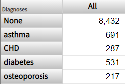
Drag and drop Diagnoses to Rows.
Or double-click Diagnoses.
The system displays the following:
-
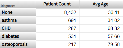
Drag and drop Patient Count to Measures.
Or double-click Patient Count.
-
Drag and drop Avg Age to Measures.
Or double-click Avg Age.
The system displays the following:
-
Click Save.
The system displays a dialog box where you specify the pivot table name.
-
For Folder, type Test
-
For Pivot Name, type Patients by Diagnosis (Patients Cube)
-
Click OK.
This saves the display context and the underlying query which retrieves the data, not the data itself.
It is worthwhile to develop a formal understanding of what we see. Note the following points:
-
The base table is Patients, which means that all measures summarize data about patients.
-
Apart from the header row, each row of this pivot table displays data for one member of the Diagnoses dimension.
In all cases, a member corresponds to a set of records in the fact table. (In most cases, each record in the fact table corresponds to one record in the base table.)
Therefore, each row in this pivot table displays data for a set of patients with a particular diagnosis.
Other layouts are possible (as shown later), but in all cases, any data cell in a pivot table is associated with a set of records in the fact table.
-
In a typical pivot table, each data cell displays the aggregate value for a measure, aggregated across all records used by that data cell.
-
To understand the contents of a given data cell, use the information given by the corresponding labels. For example, consider the cell in the asthma row, in the Patient Count column. This cell displays the total number of patients who have asthma.
Similarly, consider the Avg Age column for this row. This cell displays the average age of patients who have asthma.
-
For different measures, the aggregation can be performed in different ways. For Patient Count, the system sums the numbers. For Avg Age, the system averages the numbers. Other aggregations are possible.