X/Y Charts
X/Y Charts
An X/Y chart plots one value on the x-axis and another value on the y-axis. The data source must have at least two columns. The chart displays a data point for each row of the data source, and it connects these data points with lines.
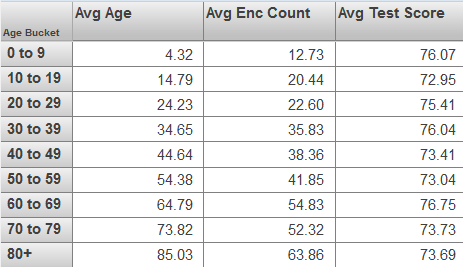
The first column determines the horizontal position of the data point, and the second column determines the vertical position. The following shows an example:
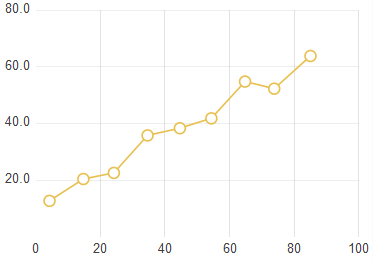
This chart is based on the following pivot table:
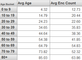
If the underlying pivot table contains additional columns, they are used to create additional sets of connected data points on the chart. That is, for each additional column, the chart contains a set of data points at the same horizontal positions. For example:
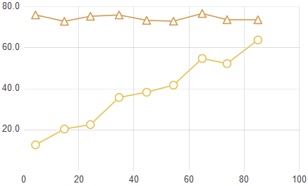
This chart is based on the following pivot table: