
Tree Maps
Tree Maps
Note:
Tree maps are available only in dashboards, not in the Analyzer.
A tree mapOpens in a new tab has one rectangle divided into smaller rectangles, each of which corresponds to one cell in the data source. The area of each rectangle is proportional to the value in the cell. If the data source displays only one measure, a tree map might look like this:
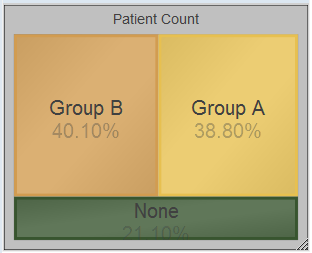
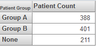
This tree map uses the following pivot table:
If the data source has multiple columns, be sure to enable the Show Multiples option. In this case, the widget displays a subdivided rectangle for each column.