
Time Charts
Time Charts
Note:
Time charts are available only in dashboards, not in the Analyzer.
A time chart is useful for displaying values over time. For this kind of chart, the data source must have time members (such as years) for rows. The following shows an example:
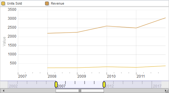
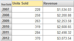
This chart is based on the following pivot table:
Time charts are supported only for levels that are based on the following time functions: DayMonthYear, MonthYear, WeekYear, and Year. Also, time charts are not recommended for spans of time greater than approximately ten years.