Pie Charts
Pie Charts
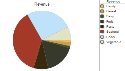
A pie chart displays one wedge for each cell of the data source. The area of each wedge is proportional to the value in the cell. If the data source displays only one column, a pie chart might look like this:
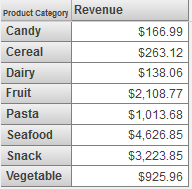
This chart is based on the following pivot table:
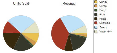
If you enable the Show Multiples option, the widget displays one chart for each column of the data source. The chart displays one wedge for each cell in that column. For example: