
High Low Charts
High Low Charts
A high low chart is similar to a bar chart but instead uses each bar to display a low value and a high value. It requires at least two columns in the data source. It displays one bar for each row of the data source. The upper and lower values are determined by the first two columns in the data source. For example:
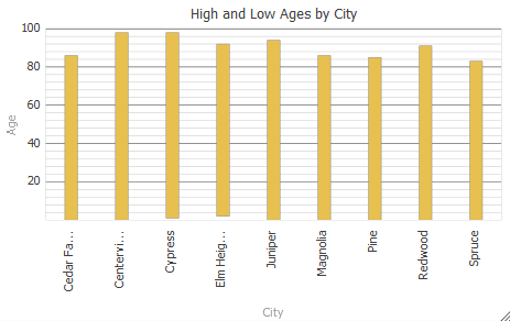
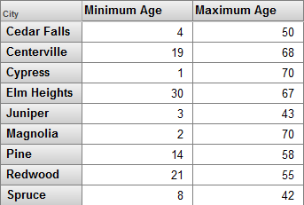
This chart is based on the following pivot table:
If there is a third column, the chart displays a triangle for that value. For example:
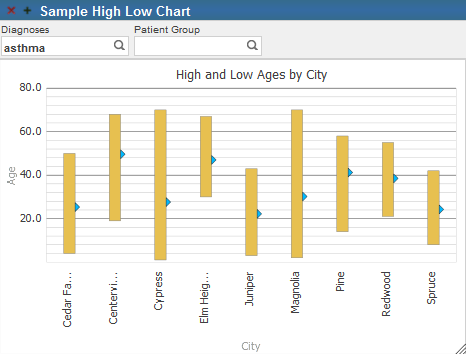
In this case, the third column displays the average values.
Other columns are ignored.