
Bullseye Charts
Bullseye Charts
Note:
Bullseye charts are available only in dashboards, not in the Analyzer.
A bullseye chart can be useful to demonstrate the size of a set relative to a larger set. The following shows an example:
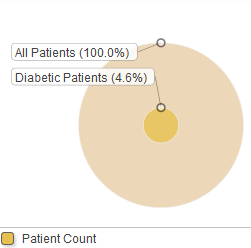
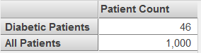
This chart is based on the following pivot table:
If the data source has multiple columns, be sure to enable the Show Multiples option. In this case, the widget displays a subdivided circle for each column in the data source.