Available Chart Types
Available Chart Types
The following subsections show examples of the available chart types:
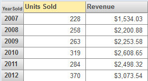
Bar and Column Charts
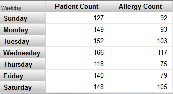
The system provides several styles of bar and column charts, both horizontal and vertical. One group of bars is created for each row of the data source. In a group of bars, each bar displays a different measure. The following example shows a chart with one measure:
This chart is based on the following pivot table:
Line and Area Charts
The system provides two line charts and an area chart. For each of these, the horizontal axis has one label for each row of the data source. One line is created for each column of the data source. (For the area chart, the area below the line is filled in.)
The following shows an example:

This chart is based on the following pivot table:
Combo Charts
Combo charts are available only in dashboards, not in the Analyzer.
The InterSystems IRIS Business Intelligence combo chart is similar to the preceding charts, but provides two unique features:
-
It can have multiple y-axes.
-
It can use different display types for different columns of the data source. The system automatically displays lines in the foreground, bars behind the lines, and areas behind the bars.
The following chart demonstrates both features:
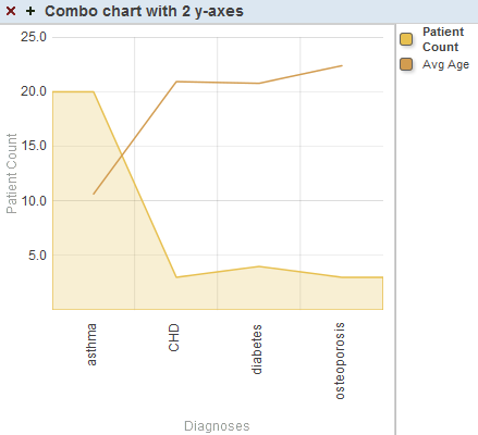
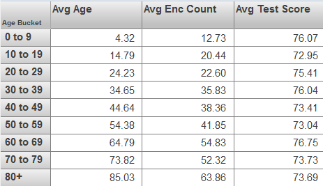
Notice that the y-axis is labeled Patient Count. The filled area that displays the Patient Count measure is scaled to match the values on this axis. In contrast, the line that displays Avg Enc Count does not correlate with the y-axis — this line is only scaled overall to fit within the chart.
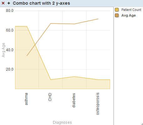
To use a combo chart, the user clicks the box next to the name of a series, in the key. If we click the box next to Avg Age, the labels on the y-axis change as follows:
This chart is configured so that for the first series, y-Axis is 1, and for the second series, y-Axis is 2.
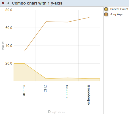
In contrast, if y-Axis is the same for both series, we would see the following (in which all the items are drawn to the same scale):
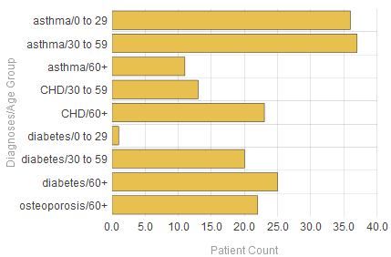
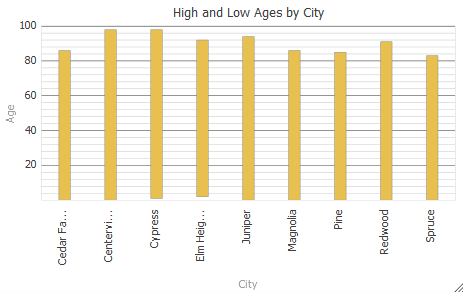
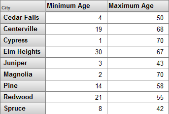
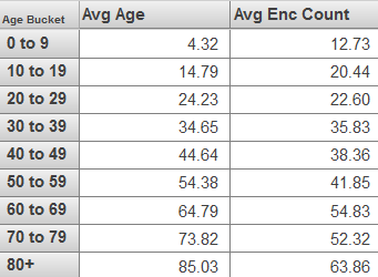
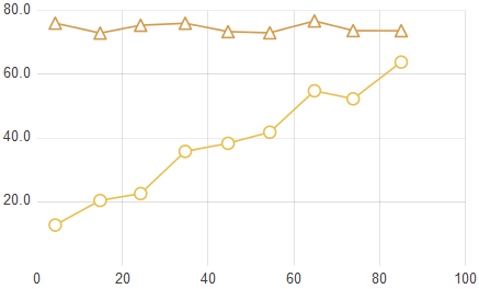
High Low Charts
A high low chart is similar to a bar chart but instead uses each bar to display a low value and a high value. It requires at least two columns in the data source. It displays one bar for each row of the data source. The upper and lower values are determined by the first two columns in the data source. For example:
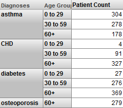
This chart is based on the following pivot table:
If there is a third column, the chart displays a triangle for that value. For example:
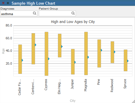
In this case, the third column displays the average values.
Other columns are ignored.
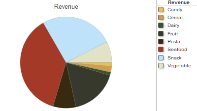
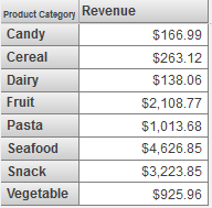
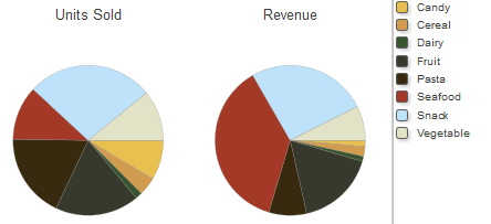
Pie Charts
A pie chart displays one wedge for each cell of the data source. The area of each wedge is proportional to the value in the cell. If the data source displays only one column, a pie chart might look like this:
This chart is based on the following pivot table:
If you enable the Show Multiples option, the widget displays one chart for each column of the data source. The chart displays one wedge for each cell in that column. For example:
X/Y Charts
An X/Y chart plots one value on the x-axis and another value on the y-axis. The data source must have at least two columns. The chart displays a data point for each row of the data source, and it connects these data points with lines.
The first column determines the horizontal position of the data point, and the second column determines the vertical position. The following shows an example:
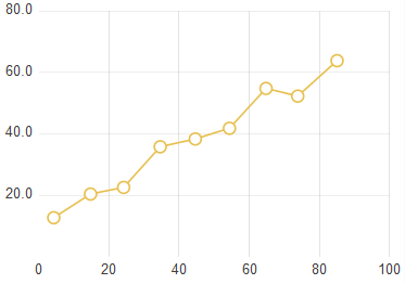
This chart is based on the following pivot table:
If the underlying pivot table contains additional columns, they are used to create additional sets of connected data points on the chart. That is, for each additional column, the chart contains a set of data points at the same horizontal positions. For example:
This chart is based on the following pivot table:
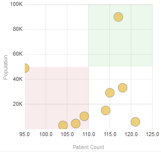
Bubble Charts
Bubble charts are available only in dashboards, not in the Analyzer.
A bubble chart is similar to the X/Y chart. It plots one value on the x-axis and another value on the y-axis. The data source must have at least two columns. The chart displays an elliptical bubble for each row of the data source. The measures are used as follows:
-
The first column determines the horizontal position of the bubble.
-
The second column determines the vertical position.
-
The third column, if included, determines the radius of the bubble.
-
The fourth column, if included, controls additional colorization that is added to the bubbles. All data rows that have the same value for the fourth measure are shown in the same color.
-
The fifth column, if included, determines the opacity of the bubble.
Other columns are ignored.
The following example shows a bubble chart that uses two columns:
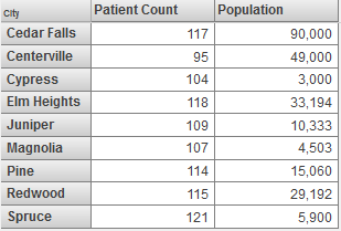
This chart is based on the following pivot table:
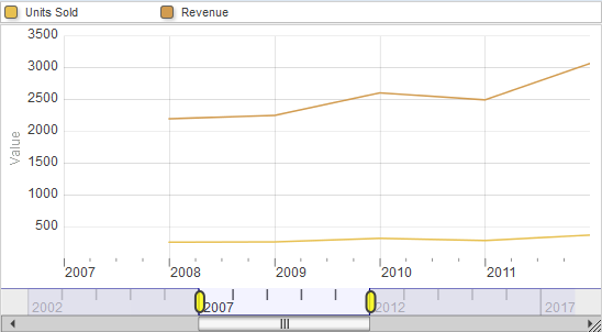
Time Charts
Time charts are available only in dashboards, not in the Analyzer.
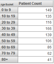
A time chart is useful for displaying values over time. For this kind of chart, the data source must have time members (such as years) for rows. The following shows an example:
This chart is based on the following pivot table:
Time charts are supported only for levels that are based on the following time functions: DayMonthYear, MonthYear, WeekYear, and Year. Also, time charts are not recommended for spans of time greater than approximately ten years.
Tree Maps
Tree maps are available only in dashboards, not in the Analyzer.
A tree mapOpens in a new tab has one rectangle divided into smaller rectangles, each of which corresponds to one cell in the data source. The area of each rectangle is proportional to the value in the cell. If the data source displays only one measure, a tree map might look like this:
This tree map uses the following pivot table:
If the data source has multiple columns, be sure to enable the Show Multiples option. In this case, the widget displays a subdivided rectangle for each column.
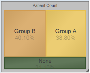
Bullseye Charts
Bullseye charts are available only in dashboards, not in the Analyzer.
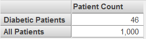
A bullseye chart can be useful to demonstrate the size of a set relative to a larger set. The following shows an example:
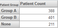
This chart is based on the following pivot table:
If the data source has multiple columns, be sure to enable the Show Multiples option. In this case, the widget displays a subdivided circle for each column in the data source.
Swirl Charts
Swirl charts are available only in dashboards, not in the Analyzer.
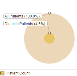
A swirl chart is similar to a pie chart. It displays one wedge (or group of wedges) for each row of the underlying pivot table. The following shows an example:
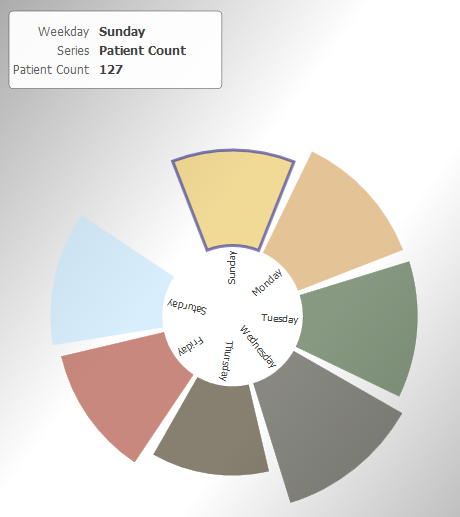
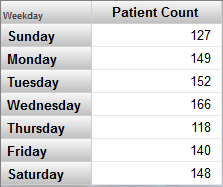
This chart is based on the following pivot table:
If the underlying pivot table has multiple columns, the swirl chart includes multiple wedges for any given row. For example:
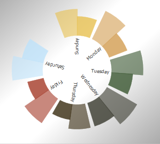
This chart is based on the following pivot table: