
Adding Scorecard Widgets
This page describes how to add scorecard widgets to a Business Intelligence dashboard.
Overview of Scorecards
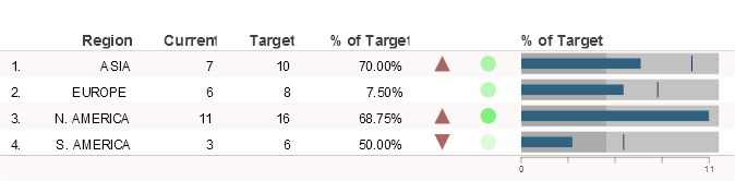
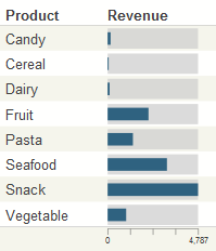
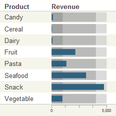
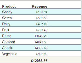
A scorecard widget displays a set of rows like the following:
You configure the columns of the scorecard, which can be the following:
-
For a KPI or production business metric, you can use each property of that item as a column of the scorecard.
-
For a pivot table, you can use each column of that item as a column of the scorecard.
In any case, you select the items to use as columns of the scorecard, and you specify the order of the columns.
For information on creating pivot tables, see Using the Analyzer. For information on creating KPIs , see Implementing InterSystems Business Intelligence. For information on creating production business metrics, see Developing Productions.
One-Measure Pivot Tables in Scorecards
Note that if you create a pivot table that displays only one measure, you must create that pivot table in a specific way if you want to display that pivot table in a scorecard. Specifically, drag and drop the measure to the Columns box in the Analyzer, rather than the Measures box.
| Rows | Columns | Measures | Comments |
|---|---|---|---|
| Anything | One measure | Nothing | This pivot table can be displayed in a scorecard. |
| Anything | Nothing | One measure | This pivot table cannot be displayed in a scorecard. In this case, the measure is used as an MDX filter and cannot be configured as a property of the scorecard. |
Adding a Scorecard Widget
To add a scorecard widget:
-
Click Menu > Add New Widget....
-
Click ScoreCard.
-
Click either Regular or Big.
-
For Data source, do one of the following:
-
Click the Search button
 and then select a data source.
 -
Use the Link to drop-down list to select another widget on the same dashboard.
-
-
Optionally specify the basic settings, as described in Adding a Widget to a Dashboard.
-
Click OK.
-
Optionally enable or disable the Mini Analyzer. For this, access to the Widget Settings menu and use the Analyzer option. This option controls whether this widget displays the Mini Analyzer
 button.
 This option is supported only when the data source is a pivot table.
-
Add at least one scorecard column.
-
Optionally configure the widget further as described in the rest of this page.
-
Optionally add widget controls.
Specifying Widget Settings for a Scorecard
For a scorecard, the Widget Settings menu has the following options:
-
Print — Select this option to include the Print button
 on the toolbar. This button enables users to print the widget to a PDF file. For further details and requirements, see Customizing Print Settings for a Widget.
 -
Analyzer — Select this option to include the Mini Analyzer button
on the toolbar. This button enables the users to open the data source in the Mini Analyzer. This option is supported only when the data source is a pivot table.
These options add a button to the toolbar. If you use these options, be sure the toolbar is visible (its display is controlled via the Toolbar option in Settings). See Reconfiguring a Widget.
Adding Columns
A scorecard does not display any data until you add columns. A scorecard column is typically based on a property of the data source. In some cases, though, a scorecard column simply displays the item name or number and does not use a property of the data source.
To add a column to a scorecard:
-
Access the Dashboard Editor and select the widget as described in Reconfiguring a Widget.
-
Click Scorecard.
-
Click Columns.
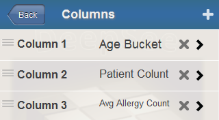
The system displays a list of any columns defined for this scorecard. For example:
-
Click the plus sign + button.
The system displays a dialog box where you specify the column.
-
For Value, select a property of the data source, type a numeric constant, or type a formula.
-
Optionally specify the following additional items:
-
Label — Type a label or optionally click the check box to the right of Label. If you click the check box, the system uses the localized name of this property as the label; this option applies only when Value is a data source property.
If you type a label, note that you can include \n to force a line break in the label.
-
Hidden — Select this option to hide this value.
-
Value Column — Select this option to configure the value in this column as the value of the row. This value is passed to any custom actions; see Specifying the Value of a Row.
Select this option for only one data property of the widget.
-
Format — Type a format string.
-
-
Click OK.
-
Configure the column as described in the rest of this page.
For information on deleting and rearranging columns, see Managing Widget Properties.
Configuring a Scorecard Column
To configure a scorecard column:
-
Access the Dashboard Editor and select the widget as described in Reconfiguring a Widget.
-
Click Scorecard.
-
Click Columns.
The system displays a list of any columns defined for this scorecard.
-
Select the column to configure.
-
Specify options as described after this list.
-
Save the dashboard.
The Display option controls most of the other choices for a property. For Display, you can choose one of the following:
| Display Option | Sample | See |
|---|---|---|
| Item Number |  |
Adding a Column of Row Numbers |
| Label |  |
Adding a Column of Row Labels |
| Value |  |
Adding a Column of Values |
| Arrow |  |
Adding Arrows |
| Lamp |  or or  |
Adding Lamps |
| Trend Line |  |
Adding Trend Lines and Trend Bars |
| Trend Bar |  |
|
| Plot Box | 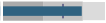 |
Adding Plot Boxes |
| Hidden | Not applicable; this property is not visible. |
The other options are as follows:
-
Value — Specifies the value, if any, to display in this column. Select a property of the data source, type a numeric constant, or type a formula.
You can omit this option if Display is Item Number or Label.
-
Label — Specifies a header for this column. You can include \n to force a line break in this label.
-
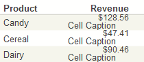
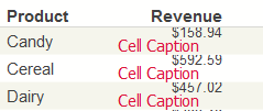
Cell Caption — Specifies an optional caption to place within each cell in this column.
For example:
-
Header Align — Specifies how to align the column header for this column.
-
Align — Specifies how to align the values in this column.
-
Width — Specifies the width of this column.
You can also modify the widths of the columns in the Size & Appearance menu of the Dashboard Editor.
-
Show As — Controls whether you display the value itself or the value as a percentage of another value, and so on. Select one of the following:
-
Value — Displays Value. This is the default setting.
-
Conditional — Displays Value if the given property is defined. If the property is not defined, the column is not displayed.
-
Sum — Displays the sum of the values given by Value.
-
Target — Displays Target Value.
-
% of Sum — Displays Value as a percentage of the total values given by Value.
-
% of Target — Displays Value as a percentage of the Target Value for the same row.
-
-
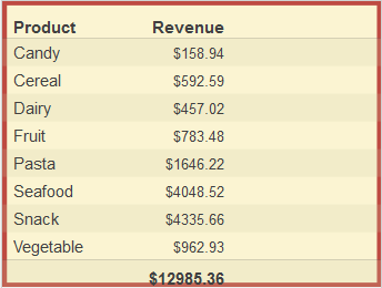
Summary — Controls what to display, if anything, in the footer, for this column. Select one of the following:
-
Sum — The summary value is the sum of the values in the column.
-
Avg — The summary value is the average of the values in the column.
-
Max — The summary value is highest value in the column.
-
Min — The summary value is the lowest value in the column.
-
Value — The summary value is specified in terms of the summary values for other columns. If you select this option, the system displays the Summary Value field. In this field, specify a formula that refers to other columns in the scorecard. For example:
=Sales-CostTo refer to a column, use the name that you specified for the Label of the column.
-
-
Format — Specifies how to format numeric values in this column.
-
Style — Controls the color and line style of the graphical objects, if any, in this column. See Specifying Line Styles.
-
Min Value and Max Value — Specify the minimum and maximum values to display if the column displays plot boxes, described later in this page.
Min Value also affects arrows. Max Value also affects lamps.
-
Target Value — Specifies the value to compare with the data values. Select a property of the data source, type a numeric constant, or type a formula.
You can omit this if Display is Item Number or Label.
-
Lower and Upper — Control the appearance of plot boxes, described later in this page.
-
Value Column — Select this if this column contains the value to pass to any custom actions.
Specifying a Scorecard Formula
You can use formulas in the Value and Target Value options for a scorecard column. The rules are as follows:
-
The first character must be an equals sign (=)
-
The formula can include the following pieces:
-
Names of data source properties (as given in the Value drop-down list)
You must enclose the name in square brackets if it includes a space or any character that would be interpreted as an operator.
For example:
=[Total Sales]/100 -
Numeric constants such as 100
-
String constants such as "my string"
-
Standard mathematical operators: + (addition), - (subtraction), / (division), and * (multiplication)
-
Logical comparison operators: > (greater than), >= (greater than or equal to), = (equal to), < (less than), and <= (less than or equal to)
-
Parentheses
The values 0 and "0" are treated as false, and all other numeric and string values are treated as true.
-
-
The formula can also include the following functions:
-
IF(test-value,value-if-test-true,value-if-test-false) evaluates a value (test-value) and returns value-if-test-true if the logical value is true or returns value-if-test-false if the logical value is false.
For example, the following formula returns 25:
=IF(1,25,99)The following formula returns either "abc" or "def" depending on the value of the PatCount property:
=IF(PatCount>1130,"abc","def") -
AND(value1,value2,value3, ... ) returns true if all the given values are true.
-
OR(value1,value2,value3, ... ) returns true if at least one of the given values is true.
-
CONCAT(value1,value2,value3, ... ) and returns the concatenation of the given values.
-
You can use formulas in the following locations as well:
-
For a plot box, in the options Min Value, Max Value, Lower, Upper, and Base Value. See Adding Plot Boxes.
-
For a column summary, in the Summary Value option. This option expresses the summary of a column in terms of the summaries for other columns.
In this case, the formula cannot refer to scorecard properties; instead it can refer to scorecard columns, using their names given by the Label option.
Configuring a Column of Row Numbers
A scorecard can include a column of row numbers, typically as the first column. The following shows an example:
To create such a column, add a column and configure it with the following options:
-
Display — Select Item Number.
The column will contain item numbers.
-
Label — Optionally specify the text to use as the column header. You can include \n to force a line break in this label.
Configuring a Column of Row Labels
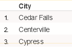
A scorecard can include a column of row labels, typically as the first or second column. The following shows an example:
To create such a column, add a column and configure it with the following options:
-
Display — Select Label.
For a KPI, the column will contain the names of the rows, as shown on the KPI test page.
-
Label — Optionally type the text to use as the title. You can include \n to force a line break in this label.
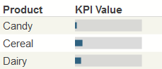
Configuring a Column of Values
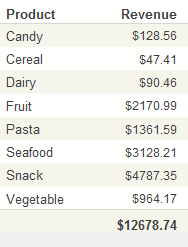
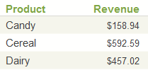
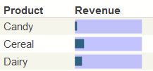
A typical scorecard includes columns that display numeric values, as in the following example:
To create such a column, add a column and configure it with the following options:
-
Display — Click Value. This is the default setting.
-
Value — Specify the value to display. Select a data source property, type a value, or type a formula.
-
Label — Specify the text to use as the column header. You can include \n to force a line break in this label.
-
Target Value — Optionally specify a target value for use as comparison with the given data value. Select a data source property, type a value, or type a formula.
-
Show As — Use any option as described in Configuring a Scorecard Column.
-
Format — Optionally specify a format string.
You use Value Column only when you configure custom actions that require row values. See Specifying the Value of a Row.
Configuring Trend Lines and Trend Bars
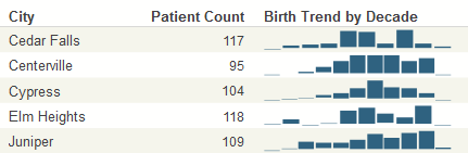
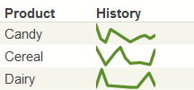
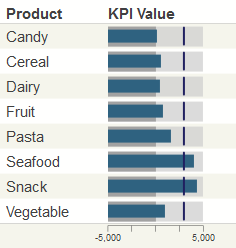
A scorecard column can display trend lines or trend bars. The following shows an example of trend lines:
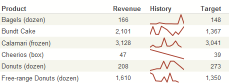
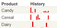
The following shows an example of trend bars:
To create such a column, add a column and configure it with the following options:
-
Display — Click Trend Line or Trend Bar.
-
Value — Specify the values to show in the trend line or trend bar. Select a data source property that contains a comma-separated list of values.
Or type a comma-separated list of values.
-
Label — Specify the text to use as the column header. You can include \n to force a line break in this label.
-
Show As — Click Value.
You can display trend lines and trend bars only for KPIs, because only KPIs can contain a column of comma-separated values. In an MDX-based KPI, you can use the %LIST function to build a comma-separated list.
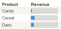
Configuring Plot Boxes
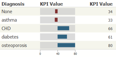
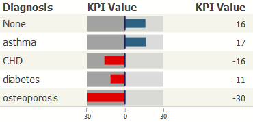
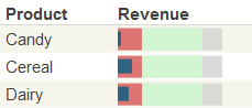
A scorecard column can display plot boxes, as in the following example:
To create such a column, add a column and configure it with the following options:
-
Display — Click Plot Box.
-
Value — Specify the value to show in the plot box. Select a data source property, type a value, or type a formula.
-
Label — Specify the text to use as the column header. You can include \n to force a line break in this label.
-
Min Value — Optionally specify the minimum value to display in the plot boxes. The default is zero.
In the following example, Min Value is –5000, and Max Value is 5000:
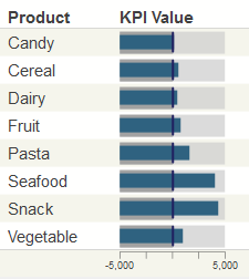
-
Max Value — Optionally specify the maximum value to display in the plot boxes. The default is the highest value displayed in the column. See the previous example.
-
Lower — Optionally specify a value to divide the box into lower and middle bands. In the following example, Lower is 1000 and Upper is 4000. These options define three bands in the plot boxes: a lower band (below 1000), a middle band (between 1000 and 4000), and an upper band (above 4000).
-
Upper — Optionally specify a value to divide the box into middle and upper bands. See the previous example.
-
Target Value — Optionally specify a target value for use as comparison with the given data value; the default is 0. Select a data source property, type a value, or type a formula.
The plot box includes a vertical line to mark the target value, as follows:
To remove these vertical lines, set Target Value equal to a value that is out of range for the plot boxes.
Also see the Base Value option for an alternative way to use a comparison value.
-
Base Value — Optionally specify a value to create a visual boundary in the plot boxes. The base value is used as follows:
-
If the actual column value is less than the base value, the bar is displayed in a contrasting color (red by default).
-
In all cases, the bar is drawn between the actual column value and the base value.
The following shows an example in which the base value is 0. This example includes an additional column that shows the actual values used in the plot boxes:
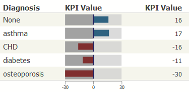
This plot box includes vertical lines at the value 0. The system draws these lines because Target Value is 0, the default.
The following shows another example in which the base value is 40:
-
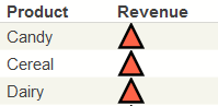
Configuring Arrows
A scorecard column can display triangular arrows, shown in the following example:
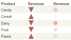
Arrows provide a quick way to see where the given value falls, in a desired range. They work as follows:
-
They use a data source property (or possibly a constant) as a source value.
-
If the Min Value setting is less than zero, then:
-
If the source value is negative, an arrow is displayed as a downward pointing triangle.
-
If the source value equals zero, the arrow is not displayed.
-
If the source value is positive, an arrow is displayed as a upward pointing triangle.
-
-
If the Min Value setting is greater than or equal to zero, then:
-
If the source value is less than Min Value, an arrow is displayed as a downward pointing triangle.
-
If the source value equals Min Value, the arrow is not displayed.
-
If the source value is greater than Min Value, an arrow is displayed as a upward pointing triangle.
-
To create such a column, add a column and configure it with the following options:
-
Display — Select Arrow.
-
Value — Specify the value to show in the arrow. Select a data source property, type a value, or type a formula.
-
Label — Specify the text to use as the column header. You can include \n to force a line break in this label.
-
Show As — Use any value as described in Configuring a Scorecard Column.
-
Min Value — Specify the value to control the direction of the arrow as described above.
Configuring Lamps
A scorecard column can display round lamps, shown in the following example:
Lamps provide a quick way to see where the given value falls, in a desired range. They work as follows:
-
They use a data source property (or possibly a constant) as a source value.
-
If the source value is negative, the lamp is displayed as a red circle.
-
If the source value equals zero, the lamp is not displayed.
-
If the source value is positive, the lamp is displayed as a green circle.
-
The opacity of the circle is determined by the absolute value of the source value, divided by the absolute value of Max Value. If Max Value is not specified, the lamp uses the largest value in the column.
To create such a column, add a column and configure it with the following options:
-
Display — Select Lamp or Lamp with Value.
-
Value — Specify the value to show in the lamp. Select a data source property, type a value, or type a formula.
-
Label — Specify the text to use as the column header. You can include \n to force a line break in this label.
-
Show As — Use any value as described in Configuring a Scorecard Column.
-
Max Value — Specify the maximum value to control the opacity of the lamp, as described previously.
Customizing the Appearance of a Scorecard Widget
The system provides a rich set of options that you can use to customize the appearance of a scorecard widget. To access these options, access the Dashboard Editor, select the widget as described in Reconfiguring a Widget and then see the options in the Scorecard section.
-
Scorecard > Size & Appearance — Provides options to control the scorecard overall.
-
Scorecard > Titles — Provides options to control the text and formatting of titles in the scorecard.
-
Scorecard > Colors & Style — Provides options to control colors and line styles in the scorecard.
The following subsections provide details.
The easiest way to systematically alter the appearance of dashboards is to define and use themes, which are discussed in Defining and Using Themes. Themes use many of the options described in the following subsections.
Size & Appearance Options
To customize the overall size and appearance of a scorecard, access the Dashboard Editor, select the widget as described in Reconfiguring a Widget, click Scorecard > Size & Appearance, and use the options listed there. The following options are available:
-
Size — Select the size of the scorecard, either Regular or Big.
-
Show Title — Use this option to show or hide the scorecard title.
-
Show Headers — Use this option to show or hide the scorecard headers.
-
Show Footers— Use this option to show or hide the scorecard footers.
-
Row Height — Use this option to control the height of the scorecard rows.
-
Arrow Size — Use this option to control the height of any arrows in the scorecard. You can override this setting and the following settings for any individual column in the scorecard.
-
Lamp Size — Use this option to control the height of any lamps in the scorecard.
-
TrendLine Hgt — Use this option to control the height of any trend lines in the scorecard.
-
TrendBars Hgt — Use this option to control the height of any trend bars in the scorecard.
-
Plotbox Height — Use this option to control the height of any plot boxes in the scorecard. In the following example, the plot boxes are slightly taller than the default:
This example also uses Plotbox Value, which controls the height of the value boxes (shown slightly shorter than the default).
-
Plotbox Value — Use this option to control the height of the value boxes in any plot boxes in the scorecard. See the previous example.
-
Column 1, Column 2, Column 3, and so on — Use these options to control the widths of the respective columns. You can also modify the column widths in the Scorecard > Columns menu of the Dashboard Editor.
Title Options
To customize the titles in a scorecard, access the Dashboard Editor, select the widget as described in Reconfiguring a Widget, click Scorecard > Titles, and use the options listed there. The following options are available:
-
Title — Use this option to specify an optional title within the scorecard.
-
Title Style— Use this submenu to control the style of the scorecard title.
-
Subtitle — Use this option to specify an optional subtitle within the scorecard.
-
Subtitle Style— Use this submenu to control the style of the scorecard subtitle.
-
Title Align — Use this option to control the alignment of the title and subtitle. These titles can be left-aligned, centered, or right-aligned.
-
Title Box — Use this submenu to add an optional box around the title and subtitle.
-
Title Image — Use this option to add an optional image to the title.
-
Image Width, Image Height, Image Top, and Image Left — Use these options to control the size and position of the optional title image.
Charts have a similar set of options; for examples, see Titles and Labels.
Colors & Style Options
To customize the colors and line styles in a scorecard, access the Dashboard Editor, select the widget as described in Reconfiguring a Widget, click Scorecard > Colors & Style, and use the options listed there. The following options are available:
-
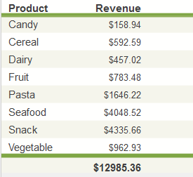
Background— Use this submenu to control the style of the background around the scorecard. For example:
-
Stripes— Use this submenu to control the style of the stripes in the scorecard. For example:
-
Separators— Use this submenu to control the style of the separators between the scorecard and the header and footer. For example:
-
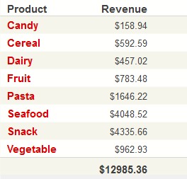
Label Style— Use this submenu to control the text style of any labels in the scorecard. For example:
-
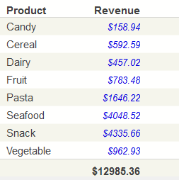
Value Style— Use this submenu to control the text style of the values in the scorecard. For example:
-
Cell Caption Style— Use this submenu to control the text style of any cell captions in the scorecard. For example:
-
Header— Use this submenu to control the text style of any column headers in the scorecard. For example:
-
TrendLine— Use this submenu to control the style of any trend lines in the scorecard. For example:
-
TrendBars Style— Use this submenu to control the style of any trend bars in the scorecard. For example:
-
Arrow Style— Use this submenu to control the style of any arrows in the scorecard. For example:
-
Lamp Color — Use this option to specify the color of any lamps in the scorecard, for use with positive values. For example:
-
Lamp Negative — Use this option to specify the color of any lamps in the scorecard, for use with negative values. See the previous example.
-
Lamp Value Style— Use this submenu to control the text style of the values for any lamps in the scorecard. For example:
-
Plotbox > Value Style — Use this submenu to control the style of the values within any plot boxes in the scorecard. In the following example, the values are displayed as blue boxes:
-
Plotbox > Below Base Style — Use this submenu to control the style of values below the configured Base Value in any plot boxes in the scorecard. In the following example, Base Value is 0 and Below Base Style is bright red:
-
Plotbox > Box Style — Use this submenu to control the style of the enclosing boxes for any plot boxes in the scorecard. In the following example, the boxes are purple rather than the default gray:
-
Plotbox > Lower Style — Use this submenu to control the style of the optional lower band in any plot boxes in the scorecard. The lower band indicates the values below the given Lower Threshold. In the following example, the lower band is red and the middle band is green:
-
Plotbox > Mid Style — Use this submenu to control the style of the optional middle band of any plot boxes in the scorecard. The middle band indicates the values above the given Lower Threshold but below the given Upper Threshold. See the previous example.
-
Plotbox > Target Style — Use this submenu to control the style of the target line, if any, in any plot boxes in the scorecard. For example:
The position of the target line is controlled by the Target Value option.