
Adding Pivot Table Widgets
This page describes how to add pivot table widgets to a Business Intelligence dashboard. These widgets can display any kind of data source, not just pivot tables.
For information on creating pivot tables, see Using the Analyzer.
Note that chart widgets are a kind of pivot table widget. For specific information on charts, see Adding Chart Widgets.
Adding a Pivot Table Widget
To add a pivot table widget:
-
Click Menu > Add New Widget....
-
Click Pivots and Charts.
-
Click Table.
-
For Data source, do one of the following:
-
Click the Search button
 and then select a data source
 -
Use the Link to drop-down list to select another widget on the same dashboard.
You can use any type of data source, not just pivot tables.
Note:If you do use a pivot table as the data source, note that pivot tables are created in the Analyzer, discussed in Using the Analyzer. The Analyzer provides options for changing the state of the pivot table: filtering, drilling down, displaying listings, and displaying in chart format. When you save a pivot table, the system saves the state as part of the pivot table definition. The next time the pivot table is accessed (either in the Analyzer or in a widget on a dashboard), the system displays the pivot table in the state in which it was saved.
-
-
Optionally specify the basic settings, as described in Adding a Widget to a Dashboard.
-
Click OK.
-
Optionally configure the widget further as described in the rest of this page.
-
Optionally add controls, as described in Adding Widget Controls.
Specifying Widget Settings for a Pivot Table Widget
To customize the available options in a widget, access the Dashboard Editor, select the widget as described in Reconfiguring a Widget, and then click Widget Settings. This menu primarily provides options for the user.
For a pivot table widget (including any chart widget), the Widget Settings menu has the following options:
-
Print — Select this option to include the Print button
 on the toolbar. This button enables users to print the widget to a PDF file. For further details and requirements, see the section Customizing Print Settings for a Widget.
 -
Chart Toggle — Select this option to add buttons to the toolbar that can toggle the display to show either the chart or the equivalent pivot table. Select chart to set the initial state as a chart, select table to set the initial state as a pivot table, or select none to disable the toggle button.
-
Drill Down — Select this option to include the Drill Down button
 on the toolbar. This button enables the users to drill down.
This option is supported only when the data source is a pivot table. The option is useful only when the rows of the pivot table display members of a higher level in a hierarchy.
-
Analyzer — Select this option to include the Mini Analyzer button
 on the toolbar. This button enables the users to open the data source in the Mini Analyzer.
 This option is supported only when the data source is a pivot table.
-
Excel Export — Select this option to include the Export button
 on the toolbar. This button enables the users to export the data in this widget to Microsoft Excel.
 -
Row selection — Use this option to display check boxes on the widget; the user can use these check boxes to select rows to which to apply actions. Select single to enable the user to select only a single row, or multi to enable the user to select multiple rows.
By default, these check boxes are not displayed, and the user cannot select rows in the widget. (The user can always select cells and ranges of cells in the widget.)
This option is supported only when the data source is a KPI.
-
Show Dimensions — Select this option to include the Dimension List button
 on the toolbar. This button provides an extra drilling option. Users can drag and drop items from this list on the gray part of the rows in the pivot table; when they do, the system drills down as requested.
This option is supported only when the data source is a pivot table and the widget is in table format.
Note:When you enable or disable this option, the Dashboard Designer automatically saves the dashboard.
-
Dimension Source — For advanced use, this option enables you to specify an alternative set of drill options to show in the dimension list.
-
Initial Execute — By default, this option is selected, which means that the system executes the query underlying this widget as soon as the user displays the dashboard. Clear this option if you want execute the query later. If you clear Initial Execute, make sure to include a refresh control on this widget. See Adding Widget Controls.
-
Pivot Preview — If enabled, this option uses the HEAD function to truncate the results of any query the widget makes involving a CROSSJOIN. Selecting the Show All button displays the full result set. By default, this option is disabled; users experiencing long load times can enable it.
Most of these options add a button to the toolbar. If you enable any of those options, be sure the toolbar is visible (its display is controlled via the Toolbar option in Settings). See Reconfiguring a Widget.
Customizing the Columns (When Displaying a KPI)
By default, when a pivot table widget displays a KPI, it displays all the columns defined in that data source. You can customize the columns. For information, see Adding Widget Properties.
Displaying a Listing in a Pivot Table Widget
To display a listing directly in a pivot table widget:
-
Do the following in the Analyzer:
-
Create a pivot table with one cell. Filter this pivot table as needed for the listing.
See Using the Analyzer.
-
Select the cell and click the listing button
 to display the listing.
 -
Save the pivot table.
-
-
In the desired dashboard, add a pivot table widget that use this pivot table as its data source.
-
Optionally add filter controls; these restrict the set of records that are shown.
Customizing the Appearance of a Pivot Table
The system provides a rich set of options that you can use to customize the appearance of a pivot table widget. To access these options, access the Dashboard Editor, select the widget as described in Reconfiguring a Widget and click Table Settings. This menu has two submenus:
-
Size & Appearance — Provides options to control the size of the data cells and the form of the pivot table. See the first subsection for details.
-
Colors & Style — Provides options to control colors, typeface, text style, and text alignment in the pivot table. See the second subsection for details.
The easiest way to systematically alter the appearance of dashboards is to define and use themes, which are discussed in Defining and Using Themes. Themes use the options described in the following subsections.
Size and Appearance Options
To control the size of the data cells and the form of the pivot table, access the Dashboard Editor, select the widget as described in Reconfiguring a Widget, click Table Settings, and click Size & Appearance. This menu has the following options:
-
Cell Width — Specify the width, in pixels, of the data cells. For example:
This example also uses Cell Height.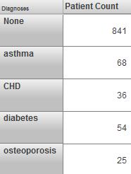
-
Cell Height — Specify the height, in pixels, of the data cells. See the previous example.
-
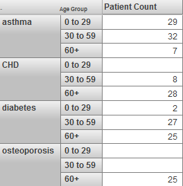
Show Empty — Use these options to control whether empty rows and columns are displayed. For example, if you enable the Show Empty option for rows, the system displays empty rows as follows:
-
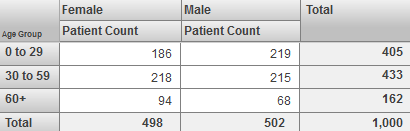
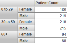
Span Labels — Use these options to control whether row and column labels are spanned.
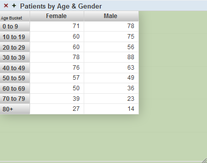
When you display the table in a nested format, the labels are spanned by default. For example:
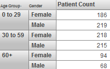
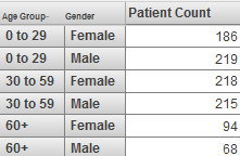
If you enable the Span Labels option for rows, the system repeats the relevant labels, as follows:
-
Row Totals — Use this option to control whether the pivot table includes a summary row at the bottom. For example:
This example also uses Column Totals.
-
Row Summary — Specify the form of the summary row. For example, choose Sum or Average.
-
Sum Over, choose either Page or All Rows. This option determines whether the summary row uses only the current page of the pivot table or all rows.
-
Column Totals — Use this option to control whether the pivot table includes a summary column at the right. See the example for Row Totals.
-
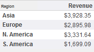
Row Caption — Use this option to display or hide the caption that appears above the row headers. In the following example. the row captions are hidden:
Color and Style Options
To control the colors, typeface, and other such aspects of the pivot table, access the Dashboard Editor, select the widget as described in Reconfiguring a Widget, click Table Settings, and click Colors & Style. This menu has the following options:
-
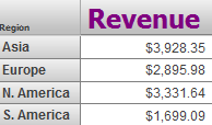
Cell Style — Use this submenu to modify the colors, typeface, text style, and text alignment used in all data cells of the pivot table. For example:
For details on this and other submenus, see Specifying Table Text Styles.
-
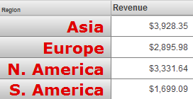
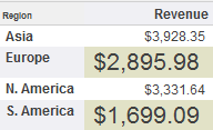
Row Style — Use this submenu to modify the colors, typeface, text style, and text alignment used in the row headers of the pivot table. For example:
-
Column Style — Use this submenu to modify the colors, typeface, text style, and text alignment used in the column headers of the pivot table. For example:
-
Stripes — Select this option to format the pivot table with zebra stripes. If you enable Stripes, the table is formatted with rows in alternating colors as follows:
-
Stripe Style — Use this submenu to modify the colors, typeface, text style, and text alignment used in the even rows, when zebra stripes are enabled. For example:
-
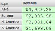
Background — Select the background color of the pivot table. For example:
-
Opacity — Specify the opacity of the background. The value 1 means 100%.
Removing a Pivot Table Redefinition
Via the Mini Analyzer, a user can redefine a pivot table as used in a given dashboard widget. See Using the Analyzer.
To remove any redefinition performed this way:
-
Access the Dashboard Editor and select the widget as described in Reconfiguring a Widget.
-
Click Type and Data Source.
-
Click Reset Data Source.
If the Reset Data Source option is grayed out, this widget uses the pivot table as it was originally defined in the Analyzer.
-
Click OK.
Or click the Mini Analyzer button , click Reset, and then click OK.